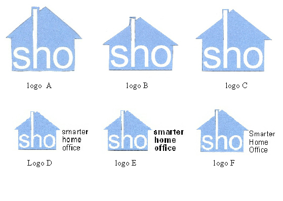
I have been doing some doodling and after two years of being stuck on a logo for The Smarter Home Office I have come up with some possibilities.
Please let me know what you think of them and which one you like best. Please excuse the blurry quality of the images and text, I had to do a work around to show multiple images and they lost their crispness.
Please share your thoughts and votes in the comments box below. Thanks! Linda

Which logo do you like best?
Hi Linda,
I like logo F.
Good Luck with whatever you choose.
Ellen
I like D because the sho are the same case as the logo.
Take care. Suzan
Hi Linda,
I like D with your company name in lower case. Although does that work with your branding in other instances?
Good luck!
Hi Linda,
I like LOGO F too. Its great looking!
Great JOB on being # 1. on AMAZON office books.
Have a nice week,
Laura
Hi Linda,
I like Logo F. Congratulations on being #1 on Amazon. That’s fantastic!
Hope to see you soon,
Cathy
Logo F
A logo is a picture, so I’d with B or C. A logo doesn’t have to have the company name within in it. In my opinion it shouldn’t. The company name will be somewhere in the ad, business card, etc. Think of some big name logos such as Apple and Nike and their “picture”. No words.
Thank you all for your feedback. You have inspired me to think more creatively. The latest versions of the logo are here: https://www.thesmarterhomeoffice.com/2012/second-round-readers-survey-of-new-logo-please-excuse-the-random-layout-trouble-with-the-software/
Stephanie – You are right: a logo is a picture, period, but establishing a brand by image only requires a $ million budget. I aspire to being an image only brand logo like Apple. Your reply made me think of how I could incorporate the name with the image. Thanks!